

Using The Grid in NimbusDash
The Grid is the table of data that feed the charts on the dashboard. Sorting, filtering, grouping, and pivoting data in the grid automatically updates all linked charts on the page. However, even without charts, the grid is a very powerful tool that allows for lightning-fast data analysis, allowing users to quickly sift through large datasets to hone in on valuable insights.
Grid Elements

- Columns – Each column can be clicked on to sort ascending or descending
- 3-Dots Menu – Each column will have a 3-dots menu that will enable sorting, sizing, pinning, grouping, and more
- Drag Bar – The grid has a drag bar which allows moving the grid container anywhere on the dashboard.
- Floating Filter – Each column will have a filter option directly below the column name. You can also use the filter icon next to the floating filter. Filter types depend on the column type (List vs Number vs Date, etc)
- Filters Tab – The filters tab at the right-hand side of the grid allows for seeing all columns at once and filter them through this pane
- Columns Tab – The columns tab at the right-hand side of the grid allows for seeing all columns at once and allow for changing the order or enabling/disabling within the grid view. You can also enable Pivot Mode and Row Grouping within the columns pane
- Pagination – The grid defaults to 500 rows per page and the pagination options allow for changing default page size and clicking through additional pages
Columns and 3-Dots Menu
- Clicking on a column header will sort the column in ascending or descending order
- Each column also has a drag bar to adjust the width of that column
- Each column will have a 3-dots menu that provides various customization options to enhance usability and flexibility. The available options include:
- Sorting: Users can sort data in ascending or descending order based on the column values, making it easier to organize and analyze information.
- Pinning: Columns can be pinned to the left or right, ensuring they remain visible while scrolling horizontally
- Sizing: You can autosize the selected column or choose to autosize all columns
- Grouping: Single or multiple columns can be grouped so aggregate series values based on the grouping. For example, group the data by account owner and provide sum of amount and count of transactions
- Choose Columns: Use the Choose Columns option to enable the quick column selector widget, which allows for quickly showing/hiding columns in the grid

Filters and Views
Filters
- Click the floating filter space or filter icon under each column to open the filter widget.
- For text values, the filters will be displayed as selectable options to enable or disable
- For number values, you will have various mathematical comparisons (equal to, greater than, less than, etc)
- For date values, you will have various date comparisons (equal to, within, etc)
- The grid will automatically refresh as you filter the columns

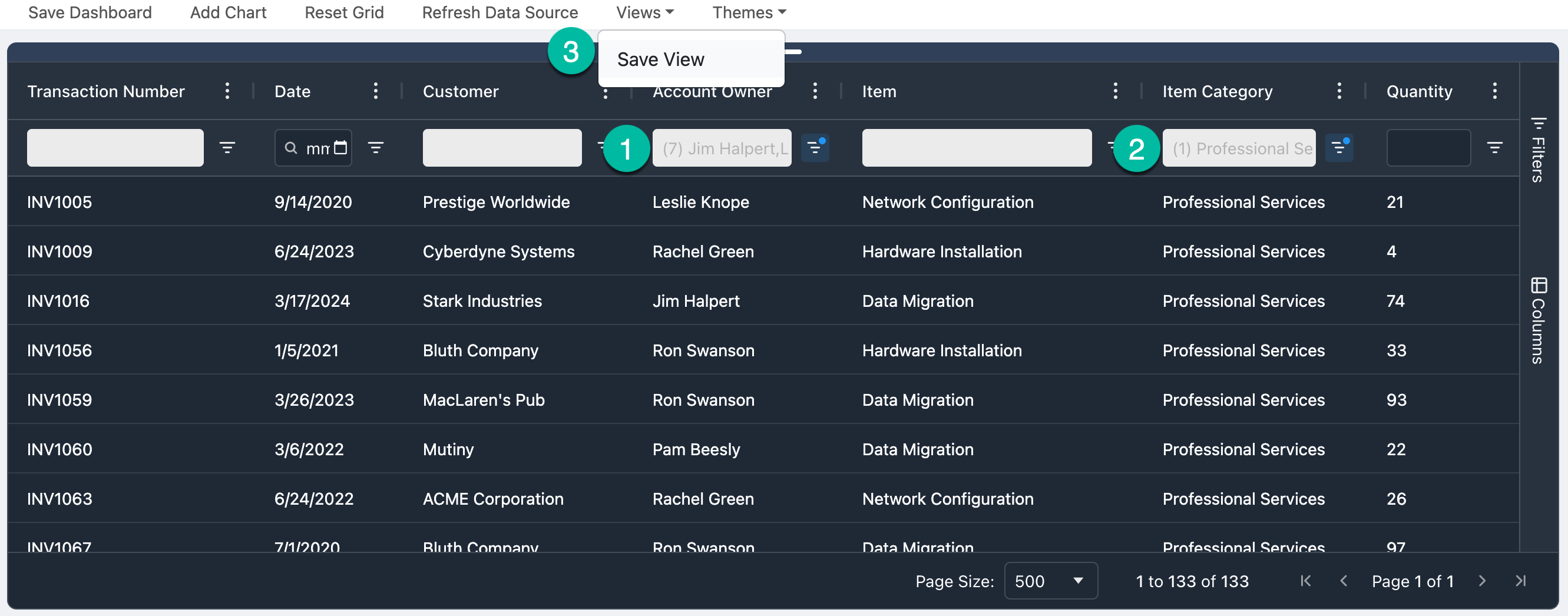
Views
- Views are used to save a collection of filters to your dashboard.
- For example, perhaps you want to save a view for Inside Channel Managers that have sold Professional Services products.
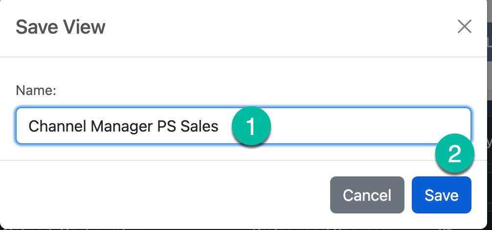
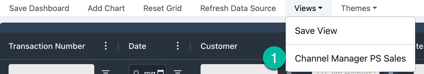
- Instead of manually creating the filters each time, set the filters once and then click the Save Menu button. This view will then be accessible anytime.
- Switch back and forth between views with a click of a button
Filters Tab
- The filters tab enabled seeing all columns and applying all filters in a single pane, as opposed to using the 3-dots for each column
- The filter icon will also display next to each column that has filters applied, giving a quick view to all filters columns

Columns Tab
- The columns tab enables seeing all columns and choosing which you would like to display or hide in the grid
- You can also drag the columns to the desired order within the grid
- In the Row Groups section, drag columns to group the data by that column in the grid
- Series types (numbers) will show in the Values section and you can choose the aggregation method (sum, count, max, etc)
- You can also enable Pivot Mode, which is described in more detail below

Pivot Mode
- Enabling pivot mode for the grid will allow for building a pivot table, much like in Excel
- Charts can then be configured based on the pivoted data
- To do this, enable the Pivot Mode toggle button
- Once in pivot mode, drag columns to the Row Groups, Column Labels and Values sections to produce the desired layout


