Table Charts
Table charts show grouped rows with one or more metrics. When period comparison is enabled, each row includes the current period value, the comparison period value, the change, and the percent change.
Use table charts when you need a breakdown by customer, department, region, product category, or other dimensions, with period-over-period change visible on every row.
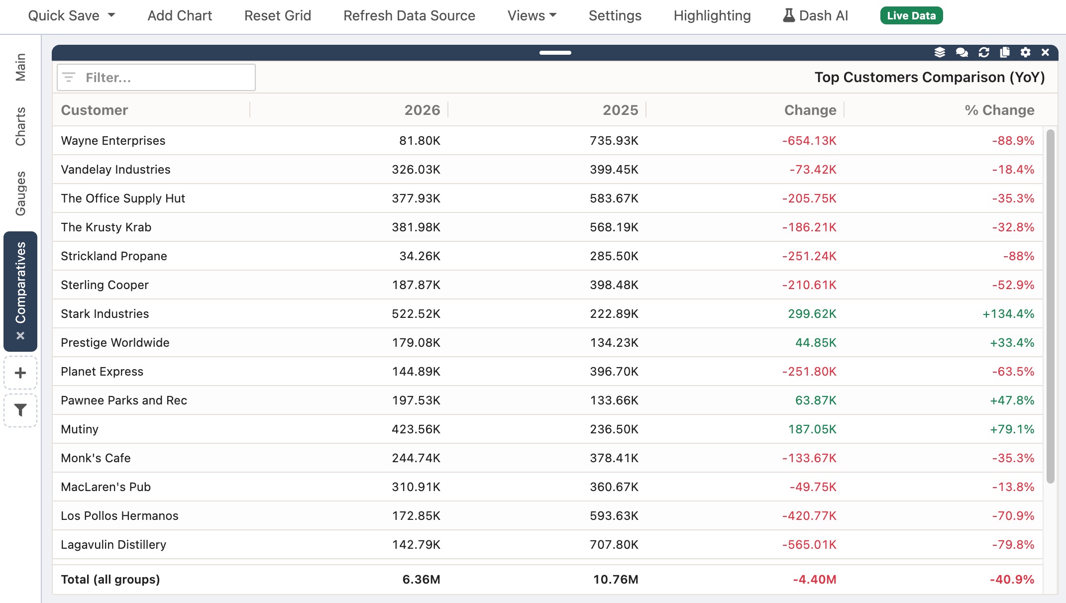
What A Comparison Table Shows
Section titled “What A Comparison Table Shows”When Compare to a prior period is enabled, the table adds comparison columns alongside your key columns:
- A column for the current period (the header shows the period key, such as
2024-03) - A column for the comparison period (the header shows the comparison period key)
- Change — the difference between current and comparison values
- % Change — the percent change; blank when the comparison value is zero
If Show totals is enabled, a totals row summarizes the current, comparison, change, and percent change columns.
Table charts can also run without comparison as a simple grouped table with one or more metrics per row. This page focuses on the comparison workflow.
When To Use A Comparison Table
Section titled “When To Use A Comparison Table”Comparison tables work well when you need answers like:
- Which departments grew revenue month over month?
- Which customers increased order volume this quarter vs last quarter?
- How did each region perform year over year?
For a single headline number with period context, consider a Radial Gauge or Linear Gauge instead.
Create A Comparison Table With Dash AI
Section titled “Create A Comparison Table With Dash AI”- Open Dash AI.
- Load dashboard data into the grid.
- Ask for a table with period comparison.
Example prompts:
Create a table of revenue by department comparing this month to last monthShow sales by customer this quarter vs last quarter as a tableTable of order count by region, this year vs last year
- Review the preview and click Apply.
Enable Comparison In The Edit Modal
Section titled “Enable Comparison In The Edit Modal”- Click Edit on the table chart widget.
- In Period Comparison, check Compare to a prior period.
- Set Period Field, Granularity, Current Period, and Compare To. See Comparative Charts for details on each field.
- Configure Keys, Metrics, and Data Rules as needed.
- Click Update Chart.
To turn off comparison, uncheck Compare to a prior period. The table returns to a standard grouped layout with your configured metrics.
Keys are the columns that group rows. Table charts support one to three key columns.
Examples:
- Department only
- Region and Department
- Customer, Item Category, and Sales Rep
When comparison is enabled, NimbusDash uses exactly one metric. The period field is excluded from keys automatically so the same date column is not used as both a key and the period field.
Metrics
Section titled “Metrics”- Without comparison: one to eight metrics per row.
- With comparison: one metric only. NimbusDash removes extra metrics if comparison is enabled.
Each metric includes a field, aggregation (such as sum or count), and an optional label.
Data Rules
Section titled “Data Rules”When comparison is enabled, Sort By includes:
- Key
- Current
- Compare
- Change
- % Change
Use Sort Direction to sort ascending or descending. Top N limits the table to the top groups. Show totals adds a summary row at the bottom.
Example Workflow
Section titled “Example Workflow”To compare revenue by department for the latest month in your data vs last month to date:
- Create or edit a table chart.
- Set Keys to Department.
- Set the metric to Amount with aggregation Sum.
- Check Compare to a prior period.
- Set Period Field to your transaction date or month column.
- Set Granularity to Month.
- Set Current Period to Latest Month in Data.
- Set Compare To to Last Month To Date.
- Set Sort By to Change and Sort Direction to Descending to surface the largest increases first.
- Click Update Chart.