Comparative Charts
Comparative charts show how a single metric in one time period compares to another. Use them for month-over-month sales, quarter-over-quarter totals, year-over-year trends, or month-to-date progress against the same point last month.
Dash AI can create comparative charts from natural language, and you can fine-tune them in the Edit Dash AI Chart modal under Period Comparison.
This page explains how period comparison works for all comparative chart types. For chart-specific details, see the type pages linked below.
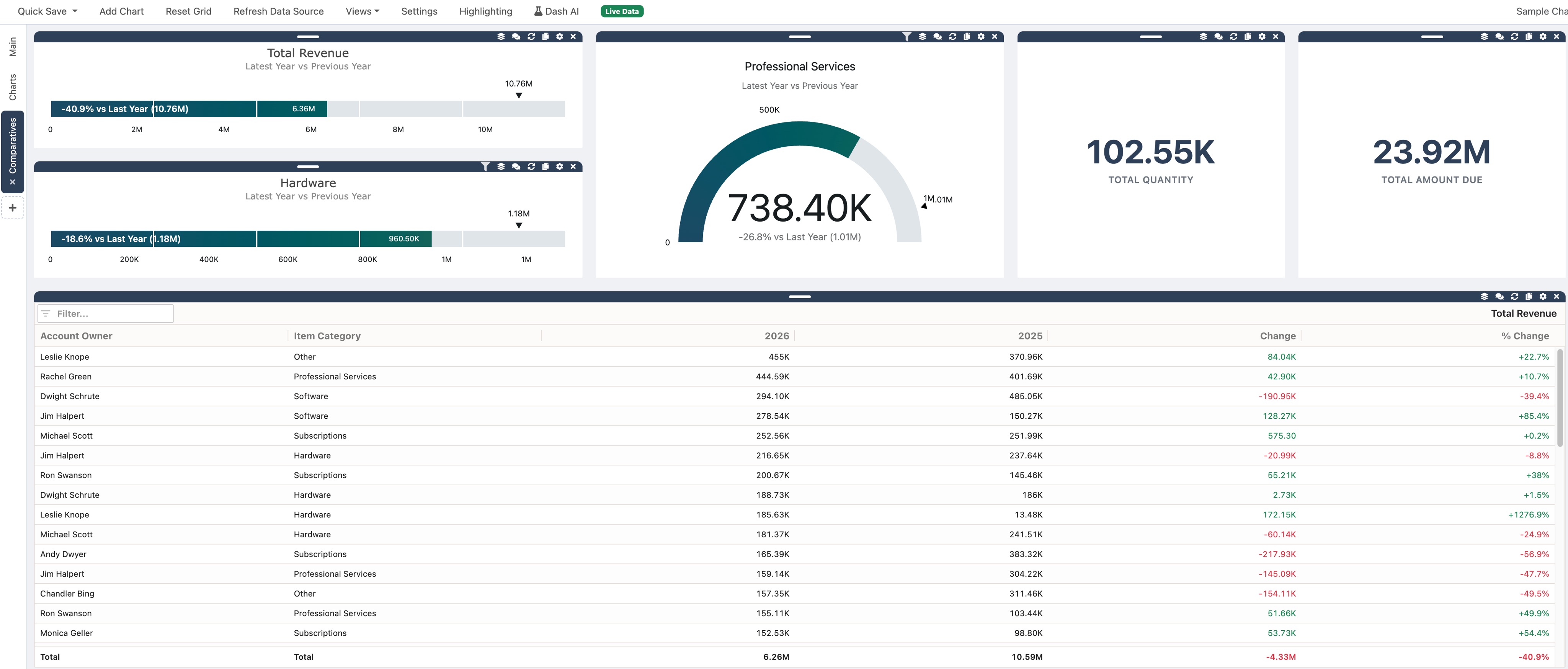
Chart Types At A Glance
Section titled “Chart Types At A Glance”| Chart type | Best for |
|---|---|
| Table Charts | Breakdowns by customer, department, region, or other groups with current value, comparison value, change, and percent change per row |
| Radial Gauges | One headline number with period context on a circular gauge, such as total sales this month vs last month |
| Linear Gauges | Same comparison as a radial gauge in a horizontal bar layout, useful for narrow widgets or side-by-side tiles |
All three types compare one metric across two periods. They do not support category breakdowns or split-by series the way bar or line charts do.
Create A Comparative Chart With Dash AI
Section titled “Create A Comparative Chart With Dash AI”- Open Dash AI.
- Load dashboard data into the grid.
- Ask for a comparative chart in natural language.
- Review the Preview Changes section.
- Click Apply.
Example prompts:
Create a gauge of total sales this month vs last monthShow revenue this quarter vs last quarter as a linear gaugeCreate a table of revenue by department comparing this month to last monthMonth-to-date sales vs last month to date as a gauge
For general chart creation steps, see Creating AI Charts.
Period Comparison Settings
Section titled “Period Comparison Settings”Open Edit on a comparative chart widget to adjust Period Comparison. The section includes four fields that work together.
Period Field
Section titled “Period Field”Period Field chooses which date column determines the time period for each row.
- A transaction date column (for example, Transaction Date) works for all comparison types, including To Date comparisons that only include rows through today.
- A month, quarter, or year bucket column (for example, Transaction Month) also works when the dashboard includes a raw date column NimbusDash can use for day-level cutoffs.
If you choose a bucket column and the dashboard has no day-level date column, To Date comparisons may fall back to full-period totals and show a warning.
Granularity
Section titled “Granularity”Granularity sets the comparison window:
- Month
- Quarter
- Year
Granularity controls which options appear in Current Period and Compare To.
Current Period
Section titled “Current Period”Current Period defines the baseline period for the comparison:
| Option | Meaning |
|---|---|
| This Month | The calendar month containing today |
| This Quarter | The calendar quarter containing today |
| This Year | The calendar year containing today |
| Latest Month in Data | The most recent month found in the loaded data |
| Latest Quarter in Data | The most recent quarter found in the loaded data |
| Latest Year in Data | The most recent year found in the loaded data |
Use This Month, This Quarter, or This Year when you want the chart anchored to the calendar. Use Latest … in Data when your dataset may not include the current calendar period, or when you want the chart to follow whatever period is newest in the grid.
When you select a To Date comparison, the current period still includes only rows through today (or through the same day count for quarter and year comparisons).
Compare To
Section titled “Compare To”Compare To chooses the prior period to compare against. Options depend on Granularity.
Month granularity:
- Last Month
- Last Month To Date
- Same Month Last Quarter
- Same Month Last Quarter To Date
- Same Month Last Year
- Same Month Last Year To Date
Quarter granularity:
- Last Quarter
- Last Quarter To Date
- Same Quarter Last Year
- Same Quarter Last Year To Date
Year granularity:
- Last Year
- Last Year To Date
- Two Years Ago
- Two Years Ago To Date
To Date options compare partial periods through today. For example, Last Month To Date on the 12th of the month compares rows from the 1st through the 12th of this month against the 1st through the 12th of last month.
Full-period options (without To Date) include every row in each period bucket.
Filters, Refresh, And Saved Dashboards
Section titled “Filters, Refresh, And Saved Dashboards”Comparative charts follow the same data rules as other AI charts:
- Charts set to Current filtered rows recalculate when dashboard filters change.
- Use Refresh on the widget to rebuild the chart immediately after data changes.
- Period comparison settings save with the dashboard. When you reload a saved dashboard, NimbusDash rebuilds each chart from the current grid data using the saved definition.
See Saving Dashboards for save behavior.
Edit Without Dash AI
Section titled “Edit Without Dash AI”You do not need a new AI prompt to adjust a comparative chart:
- Click Edit on the chart widget.
- Change Period Comparison settings, the metric, or other fields in the modal.
- Click Update Chart.
Warnings
Section titled “Warnings”If you select a To Date comparison but the dashboard has no suitable day-level date column, NimbusDash may show a warning and compare full periods instead. To get accurate To Date results, use a Period Field based on a transaction date when possible.