Radial Gauges
Radial gauges show one aggregated metric on a circular gauge, with a delta label that summarizes how the current period compares to the comparison period.
Use radial gauges when you want a single headline number with period context, such as total sales this month vs last month, on an executive dashboard tile.
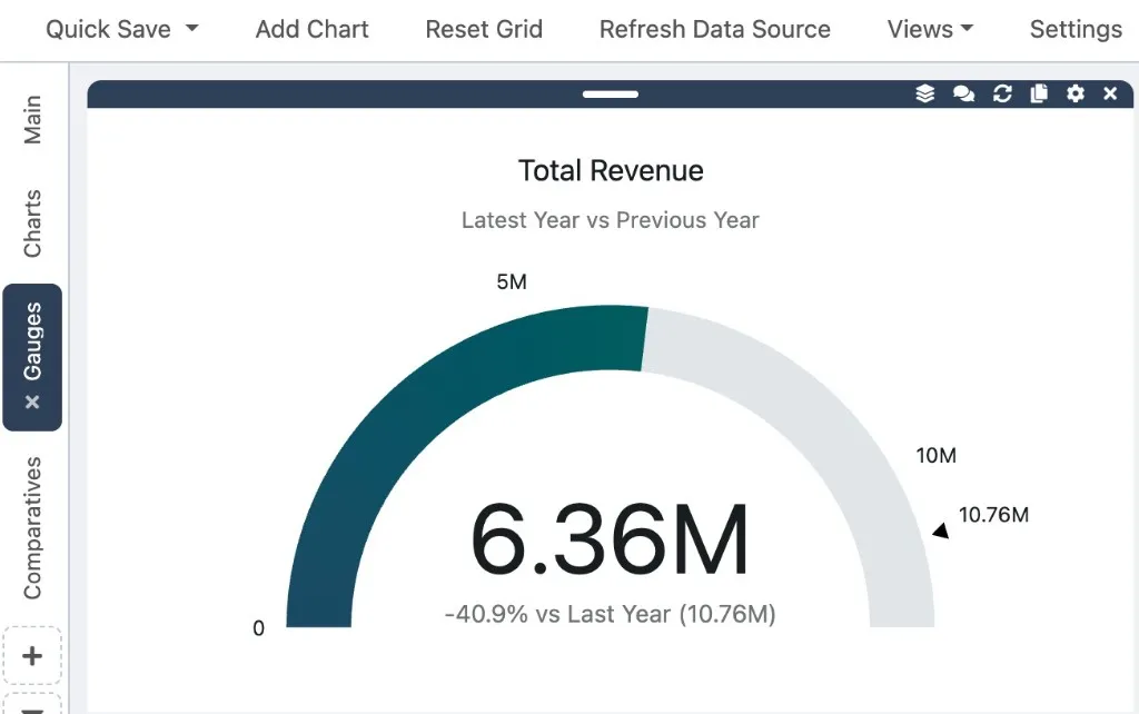
What A Radial Gauge Shows
Section titled “What A Radial Gauge Shows”A radial gauge widget displays:
- The current period value as the primary gauge reading
- A delta label showing percent change vs the comparison period, such as
+12.5% vs Last Month (1.2M) - An optional subtitle below the chart title
The gauge always compares exactly one metric across two periods. Radial gauges do not support category, split-by, or multi-metric breakdowns.
When To Use A Radial Gauge
Section titled “When To Use A Radial Gauge”Radial gauges work well when you need answers like:
- Are total sales up or down vs last month?
- How does this quarter compare to last quarter?
- Is year-to-date revenue ahead of last year at the same point?
For a grouped breakdown with change per row, use a Table Chart instead. For a horizontal layout, see Linear Gauges.
Create A Radial Gauge With Dash AI
Section titled “Create A Radial Gauge With Dash AI”- Open Dash AI.
- Load dashboard data into the grid.
- Ask for a gauge comparison.
Example prompts:
Create a gauge of total sales this month vs last monthShow revenue this quarter vs last quarter as a gaugeGauge of order count this year vs last yearMonth-to-date sales vs last month to date as a gauge
- Review the preview and click Apply.
Dash AI creates a radial gauge by default when you ask for a gauge. To request a horizontal layout instead, ask for a linear gauge or horizontal gauge — see Linear Gauges.
Configure In The Edit Modal
Section titled “Configure In The Edit Modal”- Click Edit on the gauge widget.
- Set Chart Type to the radial gauge option if needed.
- Configure Metrics with one metric (field, aggregation, and optional label).
- In Period Comparison, set:
- Period Field
- Granularity
- Current Period
- Compare To
See Comparative Charts for details on each period field.
- Click Update Chart.
Period Comparison is always required for gauge charts. NimbusDash validates that a period field is selected before updating the chart.
Switch To A Linear Gauge
Section titled “Switch To A Linear Gauge”If you prefer a horizontal bar layout:
- Click Edit on the gauge widget.
- Change Chart Type to the linear gauge option.
- Click Update Chart.
Comparison settings carry over. See Linear Gauges for layout guidance.
Example Workflow
Section titled “Example Workflow”To show total sales for this month vs last month:
- Create or edit a gauge chart.
- Set the metric to Amount with aggregation Sum.
- Set Period Field to your transaction date column.
- Set Granularity to Month.
- Set Current Period to This Month.
- Set Compare To to Last Month (or Last Month To Date for a month-to-date comparison).
- Click Update Chart.