If you’ve ever pulled a Saved Search into Excel just to build a chart for a leadership meeting, NimbusDash is built to end that. It’s a NetSuite bundle that turns a Saved Search or NimbusQL query into an interactive dashboard, live inside NetSuite, in minutes. And now, it comes with an AI assistant built in.
Built From Data You Already Have
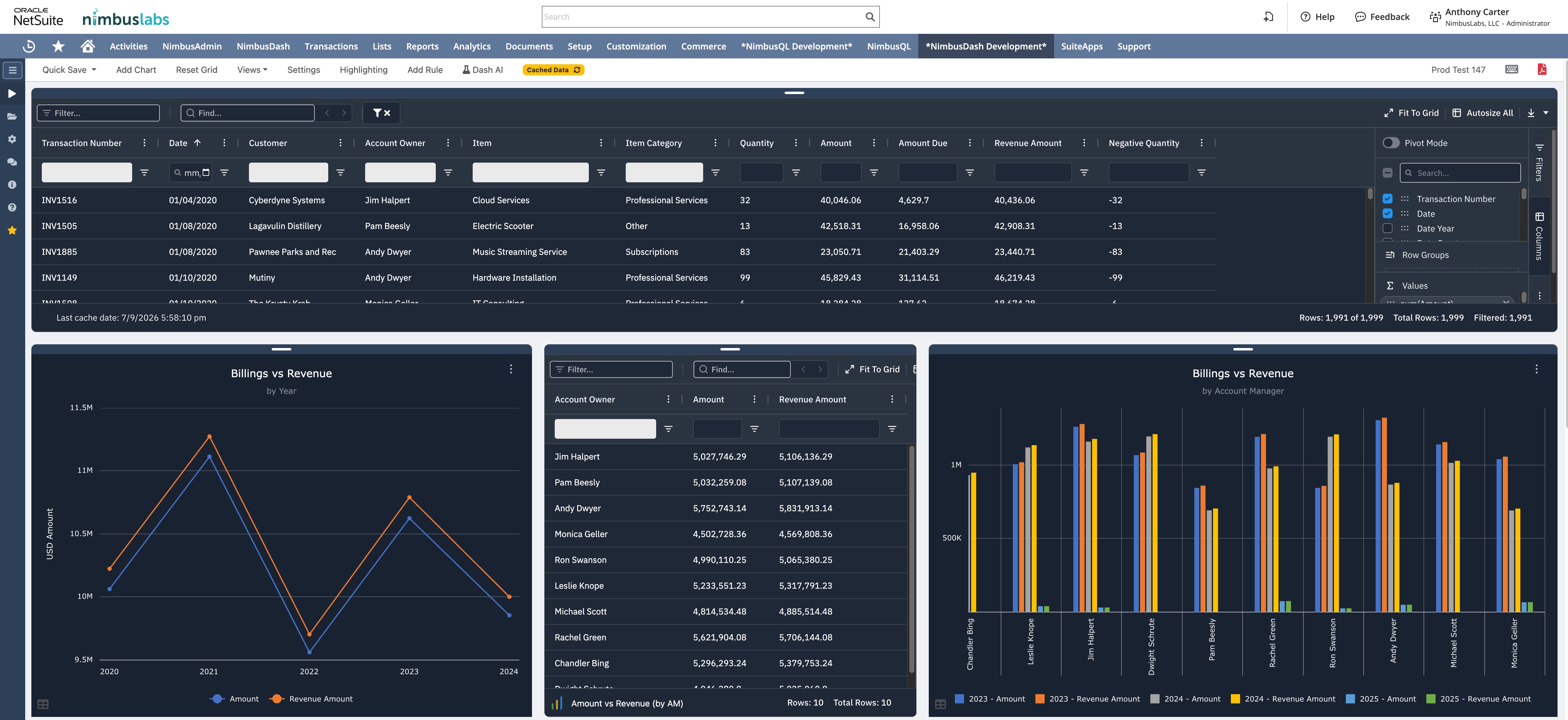
Pick a data source, either a Saved Search or a NimbusQL query, and NimbusDash builds a live grid and chart canvas from it. Add multiple charts across 25+ chart types to the same dashboard, so revenue by region, billings by account owner, and item category trends all show up side by side instead of across separate reports.
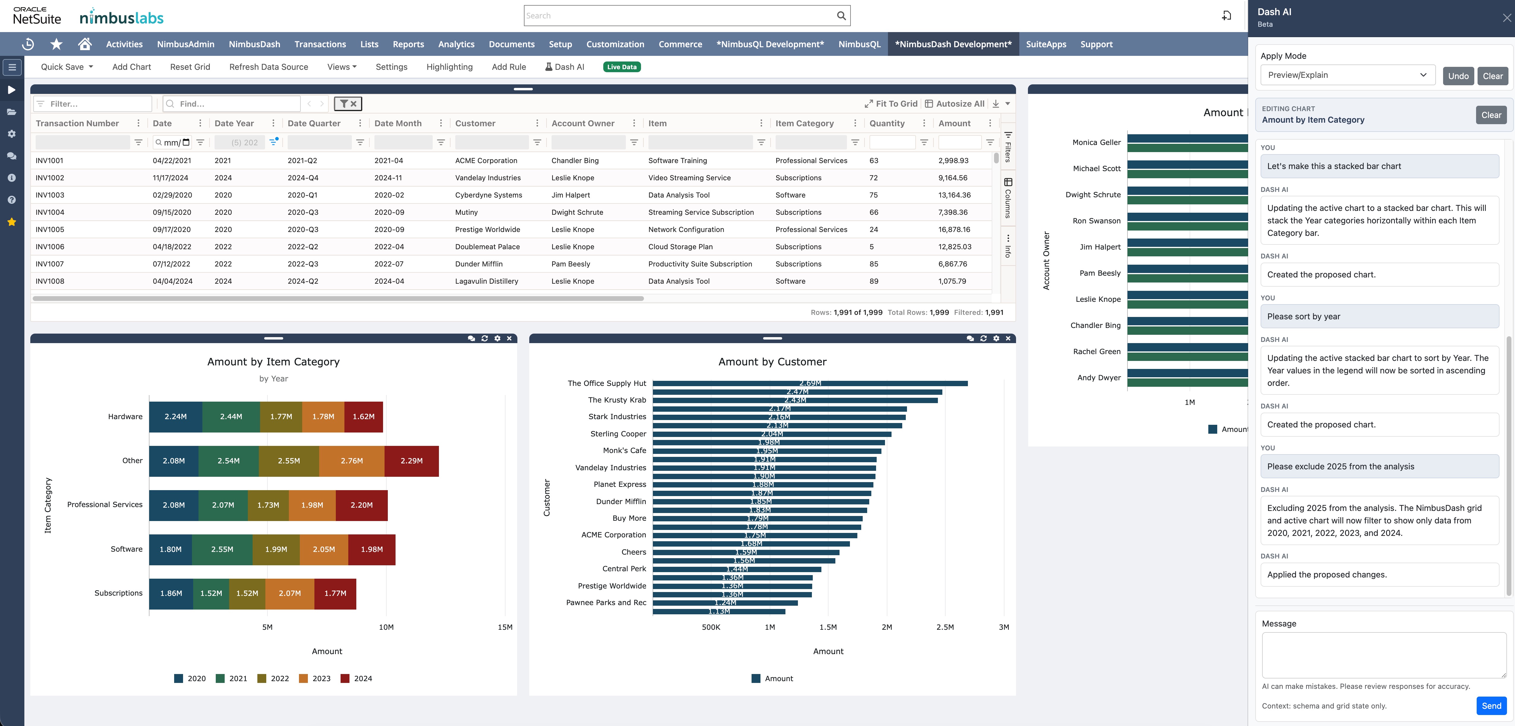
Meet Dash AI
Once a dashboard exists, Dash AI is right there to help. Connect it to your company’s own AI provider, using your own key, so it runs under the governance and data policies you already have in place.
Describe the dashboard you want in plain language and Dash AI assembles the layout, charts, and data sources for you. On an existing dashboard, ask it to filter, sort, group the grid, or change a chart type, and it proposes the change so you can preview, apply, or undo it with one click.
Filter, Group, and Pivot in Real Time
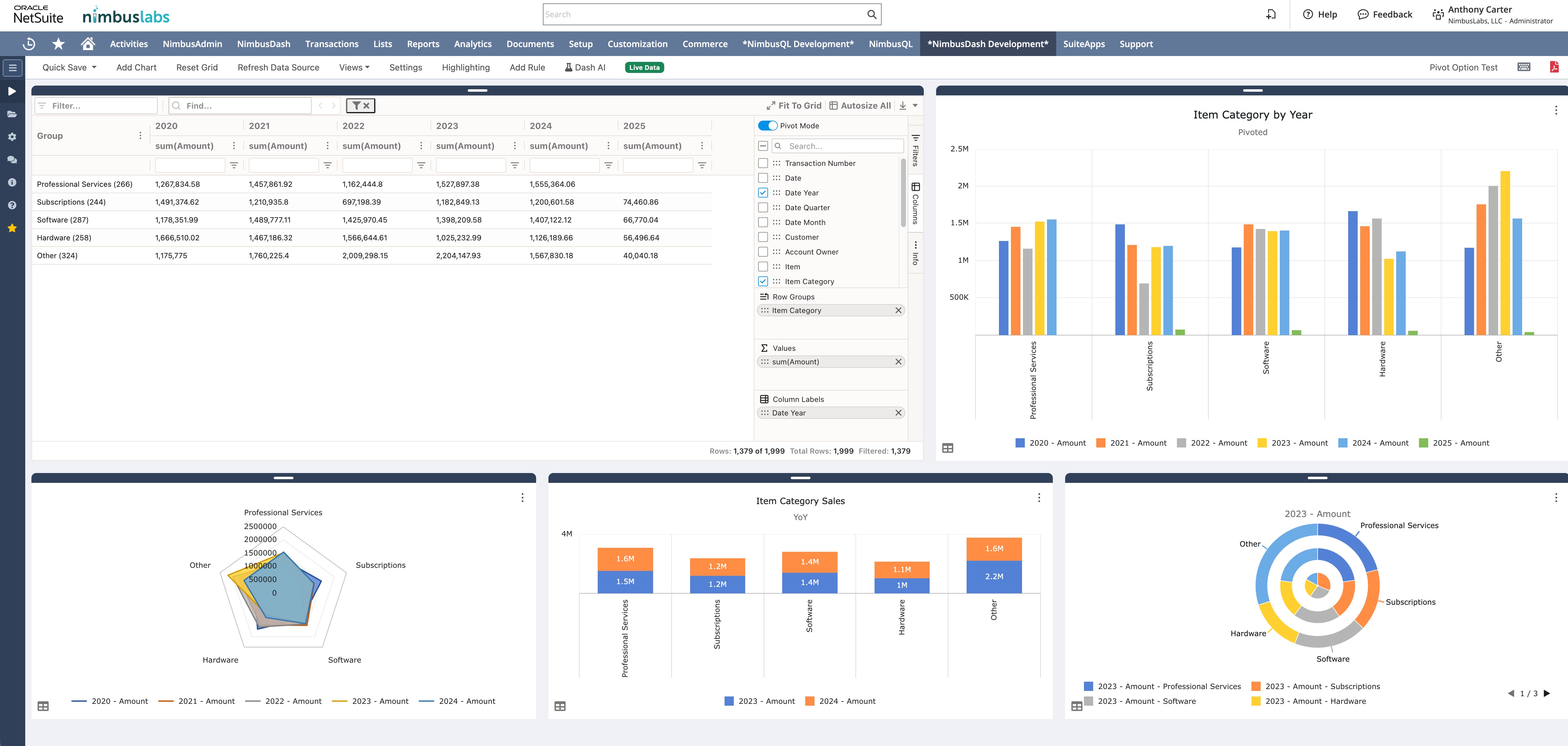
The grid supports filtering, sorting, row grouping, and multi-column sorting, all held in memory for a fast response. Flip on Pivot Mode for an Excel-equivalent pivot table, and build a chart straight from the pivoted result.
Charts That Look the Way You Want
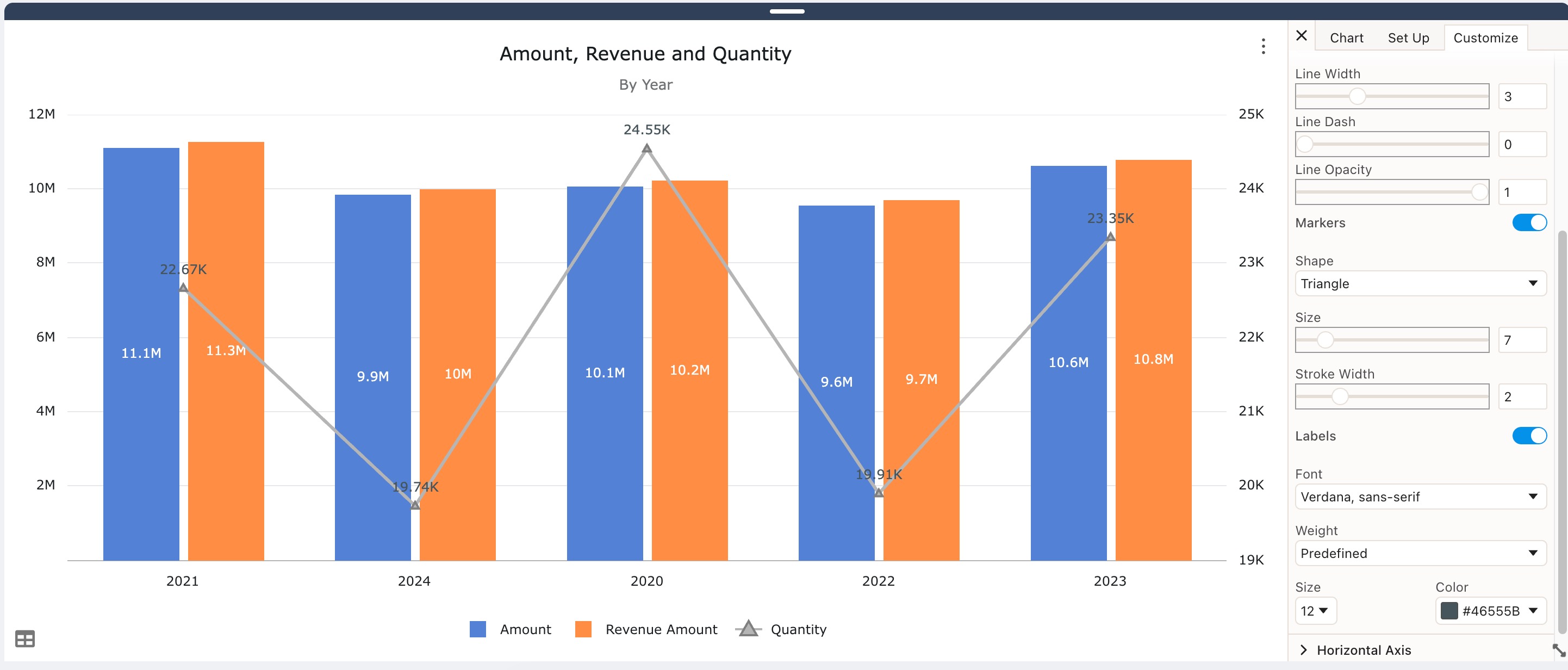
Every chart has a full customization panel: line width, marker shape and size, stroke width, fonts, and 10 preset color schemes. Titles, sizing, and layout are yours to control.
Highlighting Rules Flag What Needs Attention
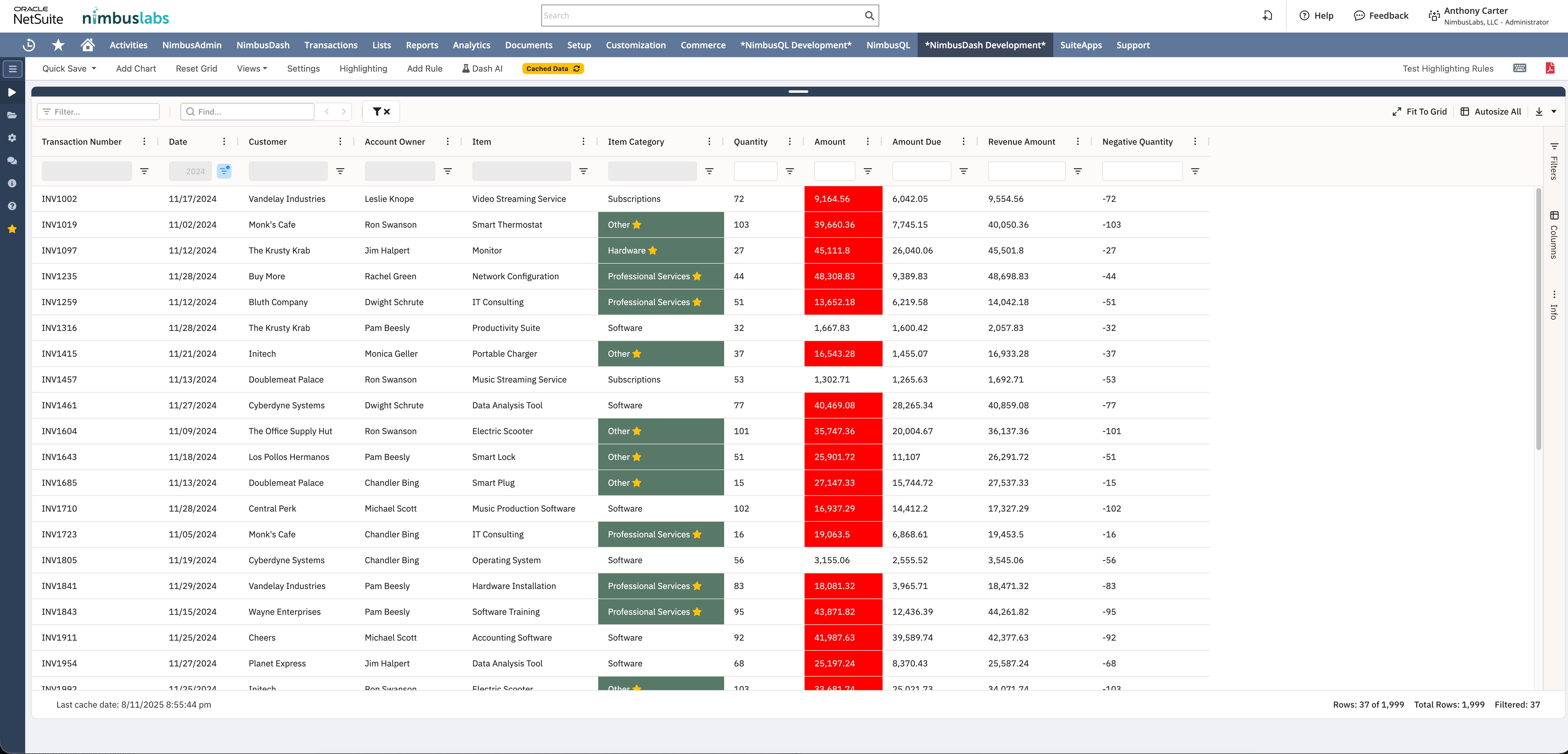
Conditional highlighting rules call out the rows and values that matter, an amount over threshold, a specific item category, without anyone scanning the grid by hand.
Dark Mode, When You Want It
NimbusDash supports both light and dark themes, so the dashboard fits how your team actually works.
Save It and Share It
Save a dashboard, reload it later, and share it with your team, with access controlled by role or by individual employee.

Try It
NimbusDash is free for 30 days, no credit card required. Worth 15 minutes to see what a live dashboard, built from your own data (and maybe built by Dash AI), actually looks like.
Questions about NimbusDash or Dash AI? Contact us, we’re happy to walk through it.